Wayfinder Brand Guidelines
We've put together these guidelines so you can represent Wayfinder accurately and consistently, without negotiating a legal agreement for each use.
Naming
"Wayfinder" is always one word with a capital "W". The two workspace modes are Simple and Advanced, capitalized. "Pro" is reserved for the paid plan: write Wayfinder Pro for the plan and never for the Advanced mode. Features are proper nouns: Agent, Paths, Trenches, Claw.
Symbol
The Wayfinder symbol is the most distinctive element of the brand. Keep it in its original design and proportions, with clear space equal to a quarter of its width on every side, and never render it below 16px.

Wordmark
Keep the wordmark in its original design and proportions so it stays consistent and recognizable. We recommend the wordmark for most uses unless otherwise specified; do not rebuild the lockup from parts. Wayfinder Pro, the paid plan, has its own wordmark.




Colors
Wayfinder's visual identity is black and white, with one green accent. Black and white carry the interface and the marks; green is reserved for actions, positive change, and the Simple mode chip. Use all three consistently so the brand stays recognizable.
Wayfinder Light
RGB 255, 255, 255
#FFFFFF
Wayfinder Dark
RGB 0, 0, 0
#000000
Wayfinder Green
RGB 13, 193, 90
#0DC15A
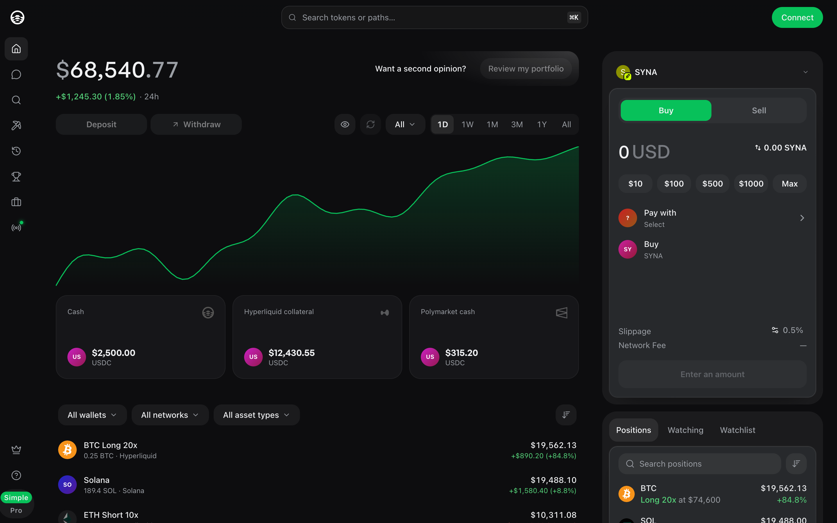
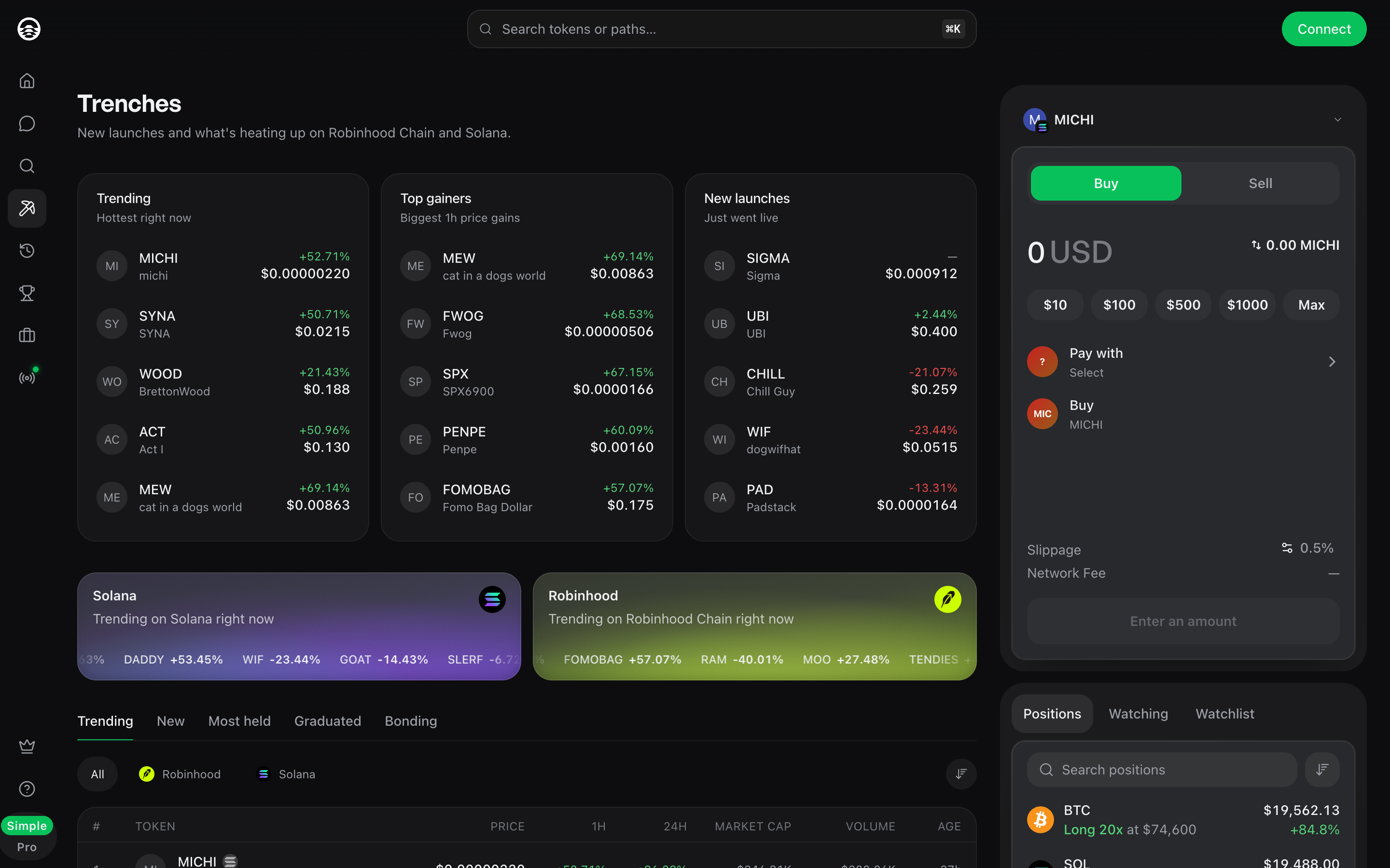
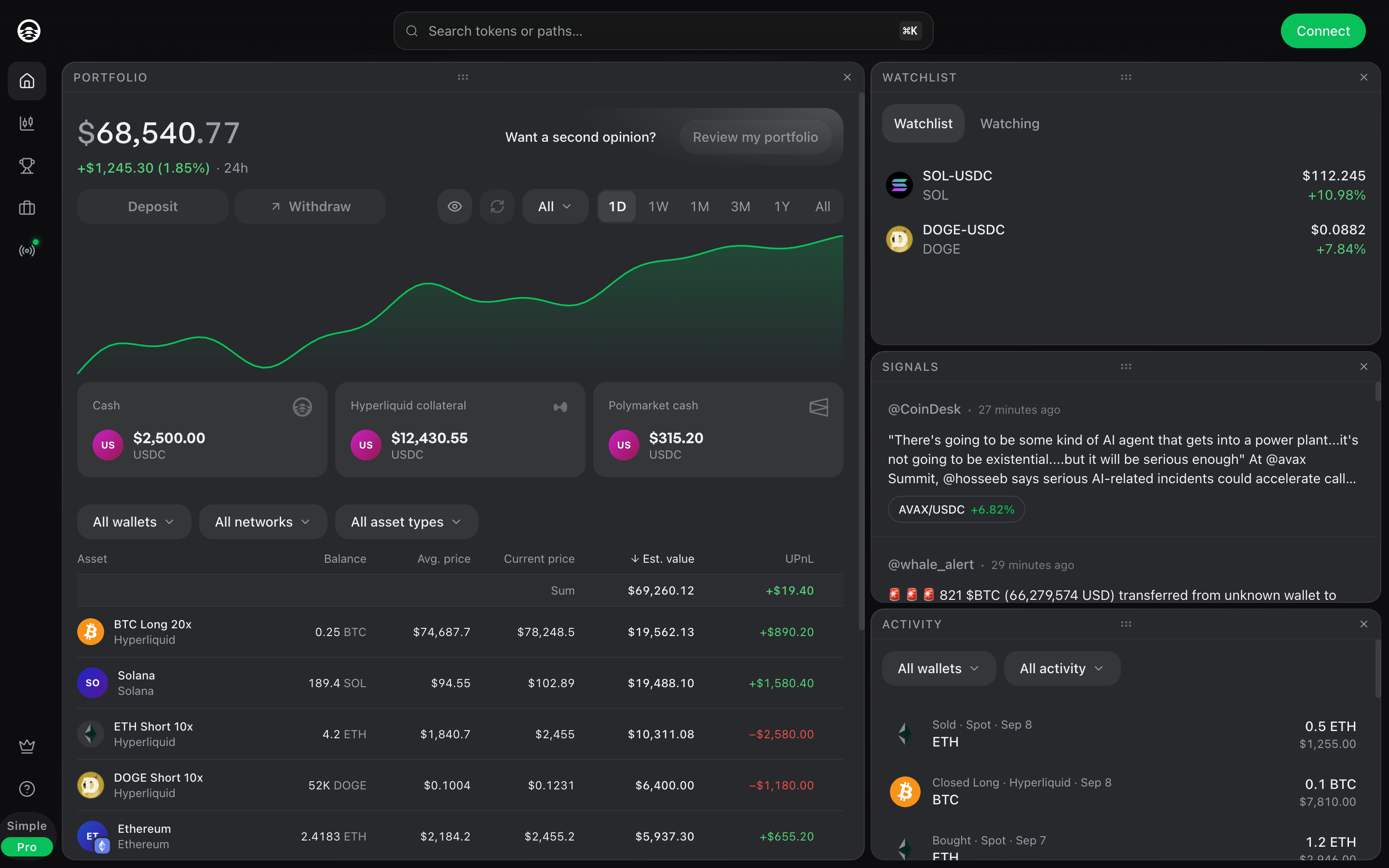
Screenshots
Product screenshots for marketing and press. They show demo data at 1440 by 900 at 2x. Use them as they are; do not crop out the chrome or recolor the interface.